top of page


Scheduler Questionnaire
Re-designing Marvin Replacement's appointment scheduling process to improve lead quality and back-end processes
Overview
Marvin Replacement (MR) is a direct-to-consumer startup for window and door replacement that delivers custom, made-to-order products. The re-designed experience for booking appointments features a questionnaire that prompts users to provide information about their project, and sends them down the appropriate path.
Role
I was the sole designer on this project. I conducted the market research, user testing, and created the UX/UI design. I collaborated with project managers and developers to bring this concept to the live site.
Duration
4 months
Background
The lead submission form on Marvin Replacement's site was very basic. It asked customers to submit their contact information, as well as a brief description of their project, before taking them to book an appointment. After scheduling their appointment, a Customer Engagement Associate (CEA) would review the project details and call the customer directly to: 1. gather more project information, and/or 2. confirm or cancel the appointment. The appointment would be cancelled or redirected for a number of reasons, including being outside of the service area, or customers asking for products and services MR does not supply.


Empathy
While the original lead-vetting process was feasible at MR's inception, the CEAs were finding it increasingly difficult to keep up with the growing amount of leads. Because of the lead form's simplicity, CEAs were tasked with manually combing through leads and calling the customers to clarify their project details. Many customers' projects were ruled as not viable, which was leading to more work for the CEAs and less return.
From a customer standpoint, it was frustrating to have made an appointment only to have it cancelled shortly thereafter. They deserved to have a better understanding of where they stand in the scheduling process from the very beginning.
Define
There were some major inefficiencies present in the original scheduling process. Empathizing with both the customers and the CEAs lead me to creating the following How Might We statement:
"How might we quickly and efficiently vet incoming leads to reduce the workload of the Customer Engagement Associates and service more projects for the company while being transparent with the customers?"
Competitor Analysis
MR has a few different competitors, all of whom require a quote or consultation appointment. Analyzing these companies's scheduling process allowed me to see what practices were most common, and where MR could stand out.


In my research, I found it uncommon for companies to allow appointment booking before the lead is vetted out by a customer service agent. Additionally, MR's competitors did not always ask for specific project information during consultation requesting. These findings informed our decision to move forward with a "gamified" questionnaire format on the MR site.
Site Mapping
I sat down with key stakeholders to determine what questions to ask (based on feedback collected from the Customer Engagement team), as well as each path the user could potentially go down.

Market Research & Inspiration
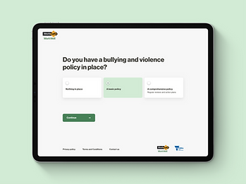
I took inspiration from designs I saw online, as well as looking at questionnaires from outside companies.


Prototype
Wireframes
I started with some analog wireframes to explore different layouts and features.

Homepage / hero ideation

Question format ideation
High Fidelity Prototypes
I created high-fi prototypes of the hero ideas in Figma to review with stakeholders. After discussing logistics, they ultimately decided to go with the progress bar and full lead form.


I further iterated on different selection tile styles in the high fidelity prototypes. The stakeholders were torn between the icons and text tiles, so I decided to run some user tests.


Icon Testing
With the selection tiles, we wanted to test whether having icons would add or detract from the user experience. First, we began by brainstorming icon ideas for the phrases "Add New Window/Door" and "Expand Existing Window/Door," as these phrases were predicted to cause the most confusion. Then, we determined which icons would fit best by surveying office personnel.

Once we had the icons nailed down, I used Maze to create a user test and gain insight from third-party testers about the use of icons. I brand-washed the questionnaire and asked testers to complete the same task with both text-only and icon tile components.


While testers felt positively about both tile formats, the results ultimately swayed more towards using the icons for the questionnaire.
Final Product
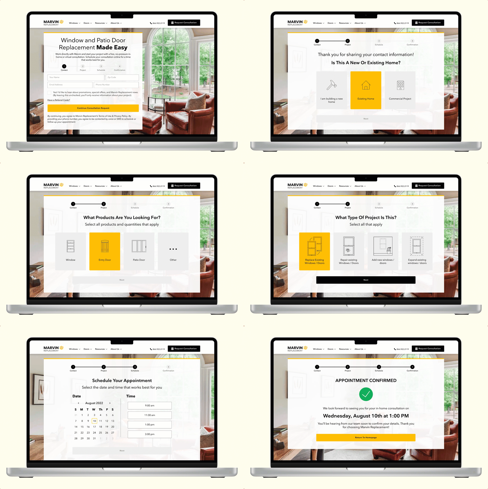
The final questionnaire experience features a progress bar that indicates where the customer is in the scheduling experience. Having each question on its own screen allows the data to be captured on the back end in Salesforce, allowing the Customer Engagement team to follow up on any partially-completed questionnaires.
Outcome
The implementation of the scheduler questionnaire lifted a huge weight off of the Customer Engagement Associates' shoulders. Because a significant portion of the unviable leads were redirected to other departments, the CEAs could focus on those which were more likely to convert, as well as dedicate more time to other tasks.
Takeaways
Working on this project taught me that the end user isn't always necessarily the customer. The work that happens behind the scenes can greatly impact the customer's experience, so it's important to make processes that are efficient of all of those involved.
bottom of page